


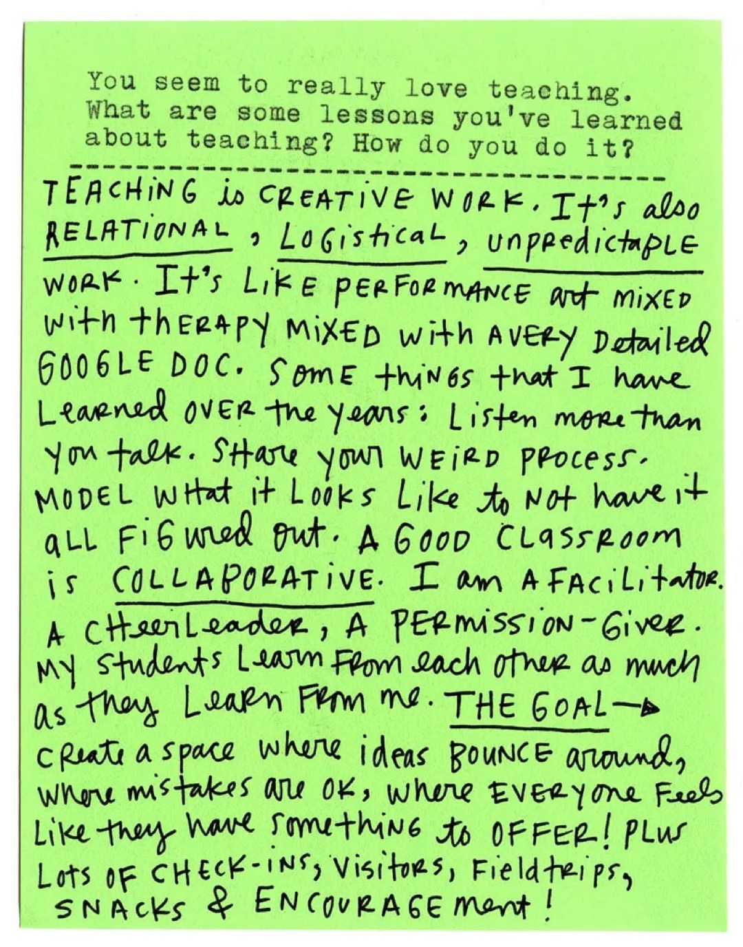
Hello to all the new folks who found me through Austin Kleon’s Typewriter Interview series! He shared mine a few weeks ago, and I had such a fun time working on it. I took my sweet time getting him my analog responses, but thankfully, he did not write me off. You can read the whole thing here.


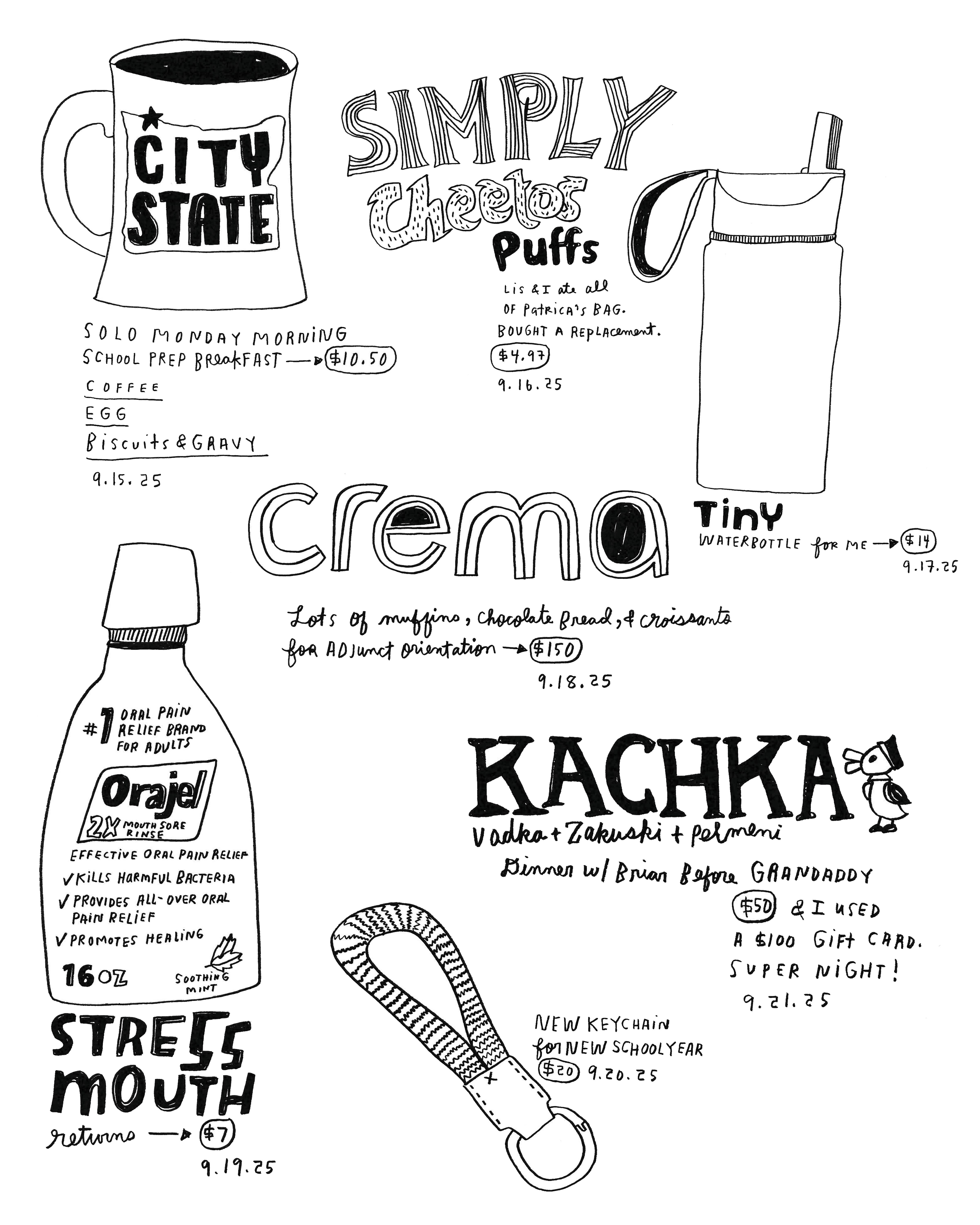
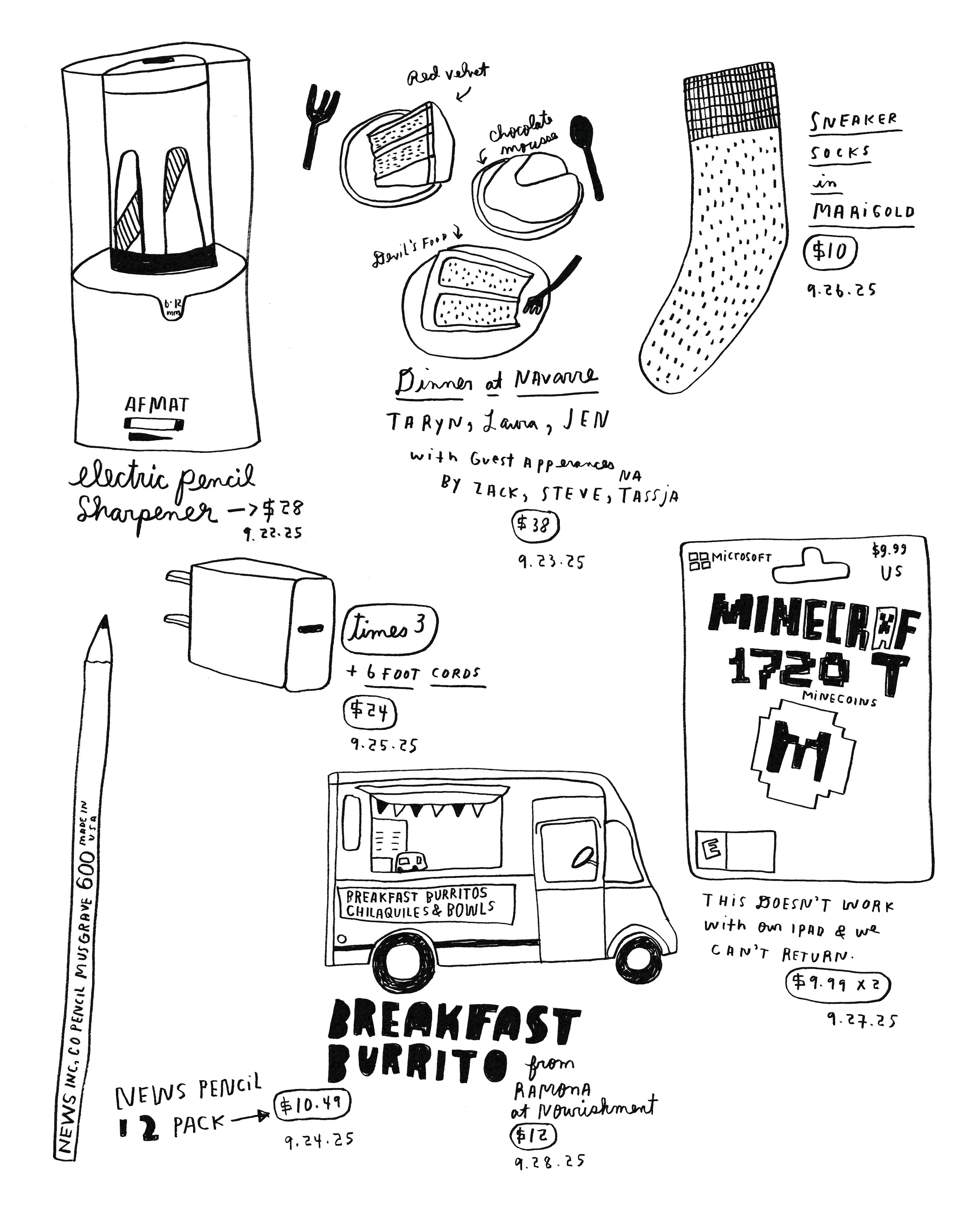
Since then, the only drawings I have managed to make outside of my daily purchase drawings have been for school. I made a map of all the buildings that make up The Schnitzer School of Art + Art History + Design, along with a scavenger-hunt card for our open house, which kicked off the new school year. Both were such a joy to draw, full of chaos, community, and celebration of everything that happens in those spaces.

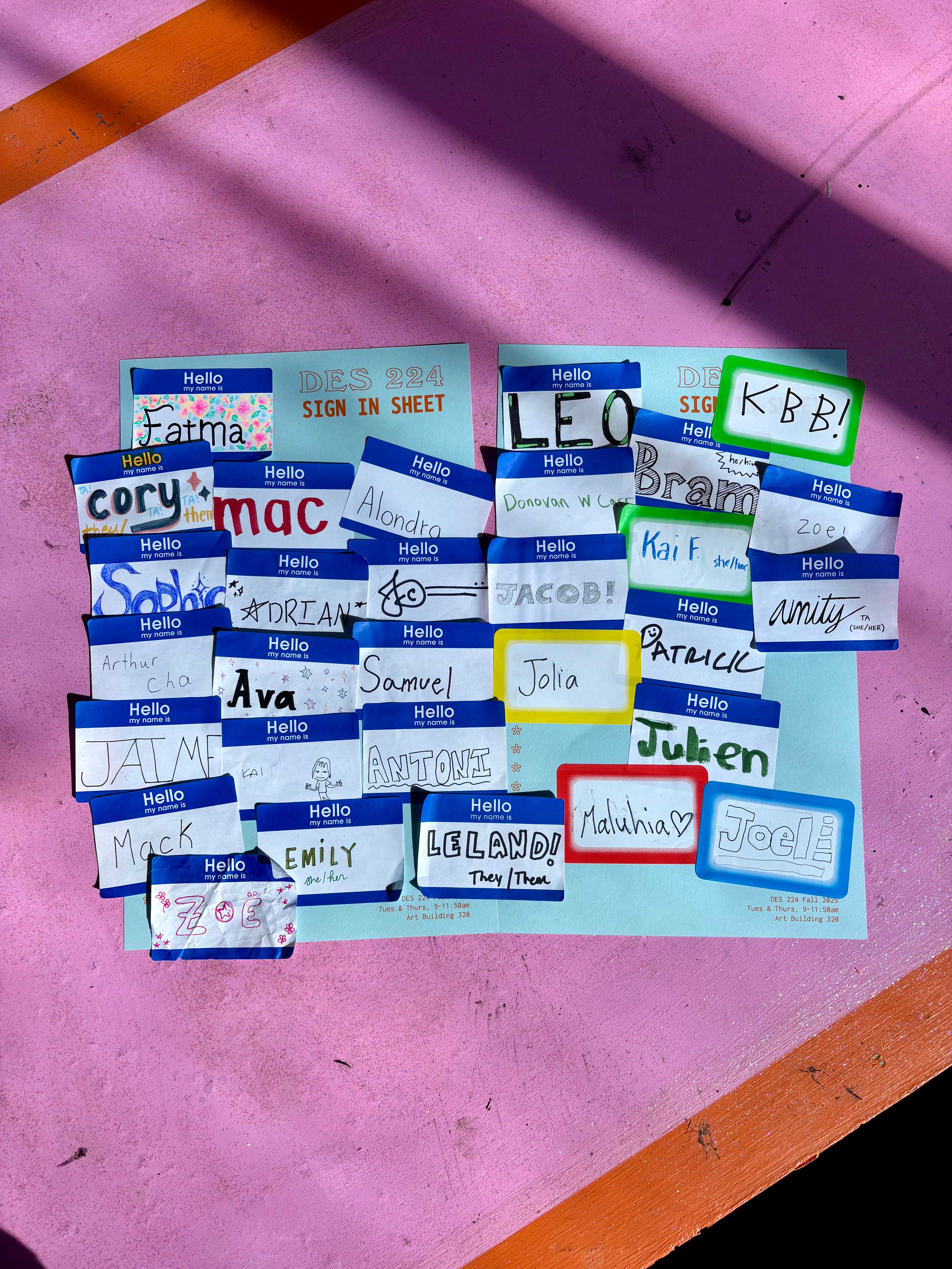
This term, I’m co-teaching a class for our second-year students at PSUGD with Leland. Alongside studio exercises, we also have a weekly reading response series. I wanted to share a bit more of my teaching with you all, so I am going to start sharing more about what goes on in my classroom, starting with this week's readings.
Our theme: Finding Inspiration (Without Forcing It)
The following links all view inspiration as a practice, not a waiting game for an A-HA moment. And how it’s about showing up, paying attention, practicing, giving yourself a little grace, not expecting perfection, and building up those creative muscles.
Jessica Hische: “Inspiration vs. Imitation”
Jessica Hische is a lettering artist, illustrator, and author known for her joyful, intricate work for clients like Wes Anderson, The New York Times, and Penguin Books. In this essay, she breaks down the myth of waiting for inspiration to strike and reminds us that showing up and making something, ANYTHING, is what actually creates momentum. This essay was built upon a comic that Jessica first uploaded to freaking Flickr in 2010.
→ Read here
Ira Glass: “The Gap” (video)
In this classic fan-made video, Ira Glass (of This American Life) talks about “the gap,” the space between your taste and your ability, and how the only way to close that gap is through consistent, honest work. It’s a must-watch for anyone who has ever felt frustrated by their own creative progress. I have also talked about this dang quote for over 15 years. It’s a classic!
→ Watch here
Austin Kleon: The Inspiration for Tomi Ungerer’s The Three Robbers
In this post, Austin Kleon shares how illustrator Tomi Ungerer found the spark for his children’s book The Three Robbers in an old piece of printed ephemera: a German sheet called the Münchener Bilderbogen. Ungerer didn’t invent his idea out of thin air; he translated and transformed what he found into something new. The book is my favorite kids’ book, and I am pretty sure the animation is one of my favorites as well! You know you are in for a treat when you see the Weston Woods logo bumper!
→ Read here
→ Watch here
For this upcoming week, we are shifting gears a bit. I am building a new list of readings and videos on the theme “Looking Closely” as we dive into moodboards and visual research for the students’ first big project. It is one of my favorite weeks of the term, when everyone starts gathering images, textures, and references that hint at what their projects want to become.
If you have any favorite articles, essays, or videos that explore the idea of looking closely, seeing differently, or paying attention in creative work, I would love to hear about them. I am always collecting material to share with students, and I am especially excited to introduce them to the work and teachings of longtime fave Rob Walker soon.

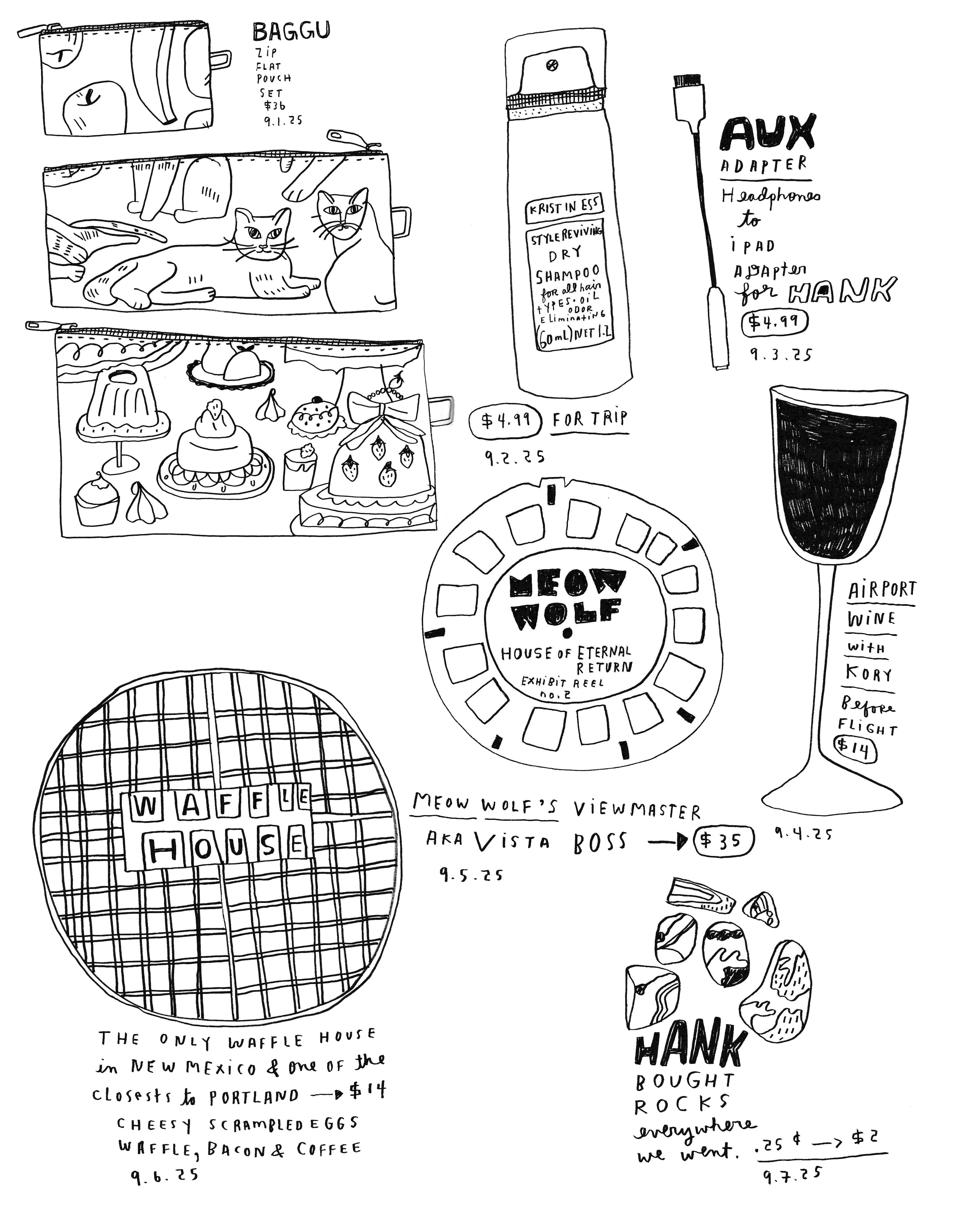
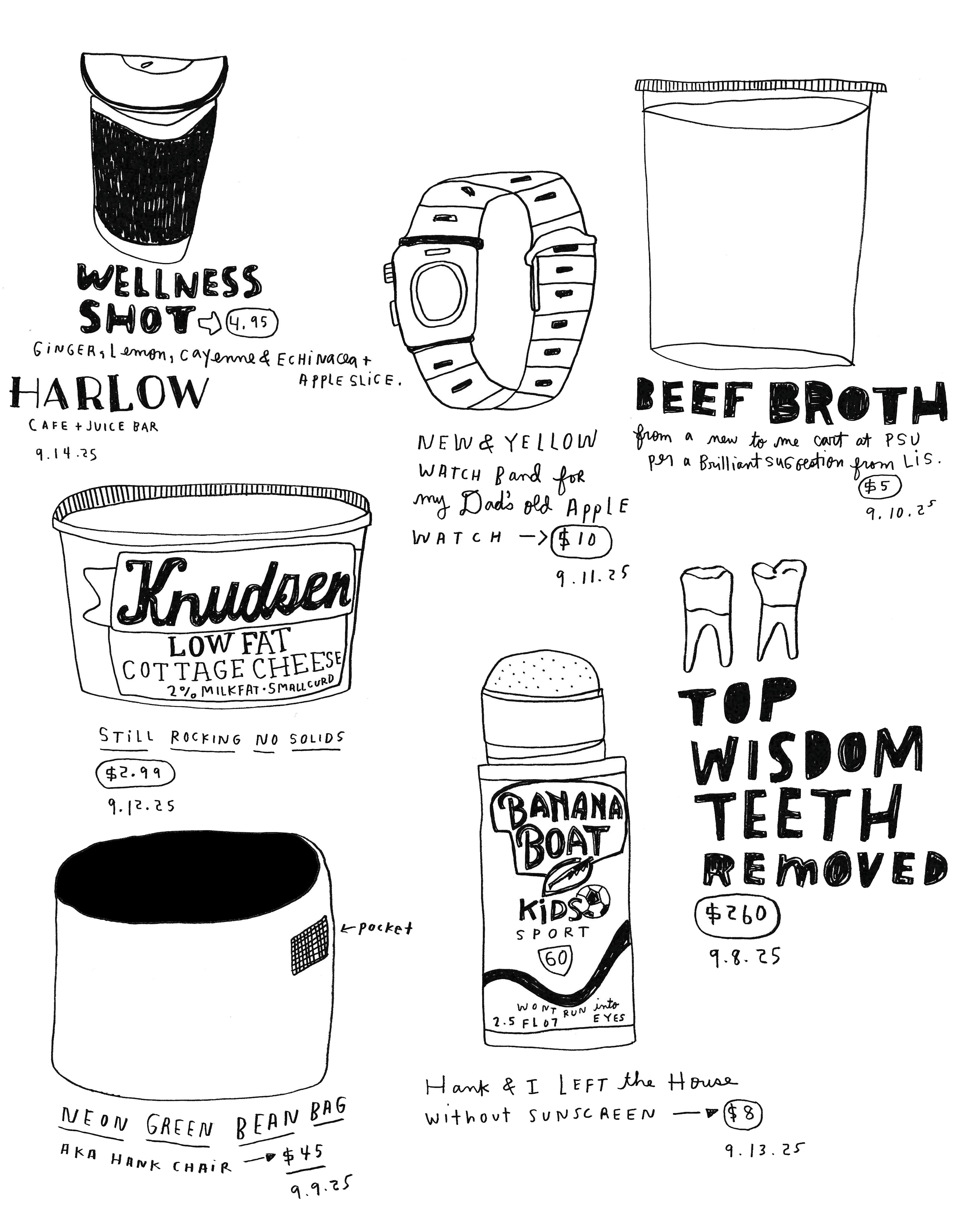

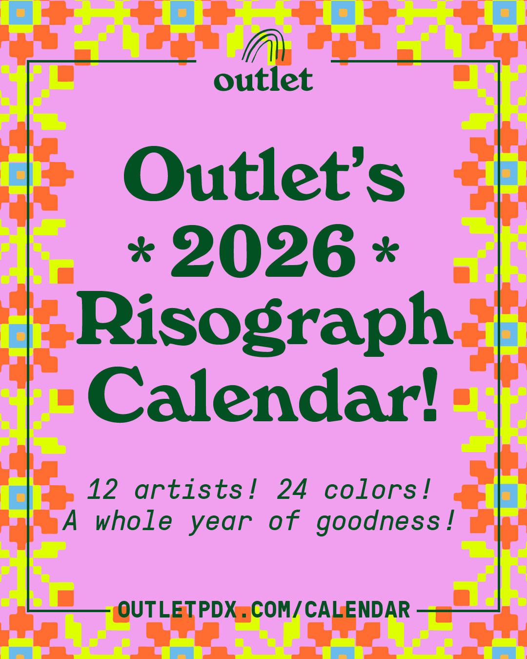
In Outlet news, we are swinging into HOLIDAY SEASON TIME! Last week, Leland launched our 2026 calendar pre-order and our call for submissions! We’ve printed these every holiday season for 6 years now, and we feel lucky to have the creative folks we know and love and print with (and some new friends too!) participate. A little calendar history: every year, we take submissions from local artists to create a vibrant 2-color risograph-printed and bound calendar. The theme of the calendar this year is BRIGHTNESS!
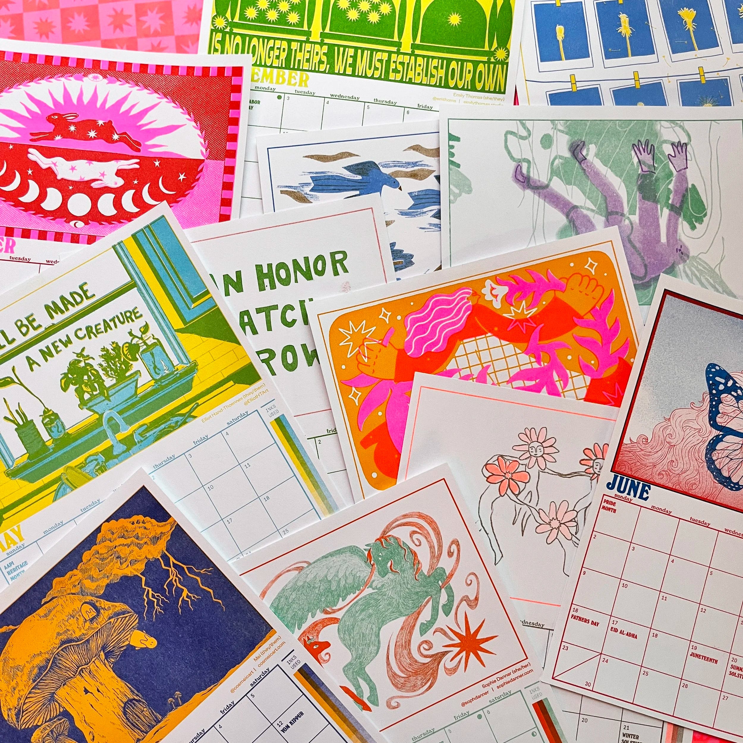
We design this calendar with printmakers, designers, riso nerds, and print collectors in mind—you can trim the artwork out to keep and frame (12 beautiful prints!), and we include color combinations, special inks and papers, and other extras that can serve as a swatchbook and inspiration for any future projects!
In other Outlet news: I have a lot of things to make for upcoming holiday markets, stop yelling at me. :)

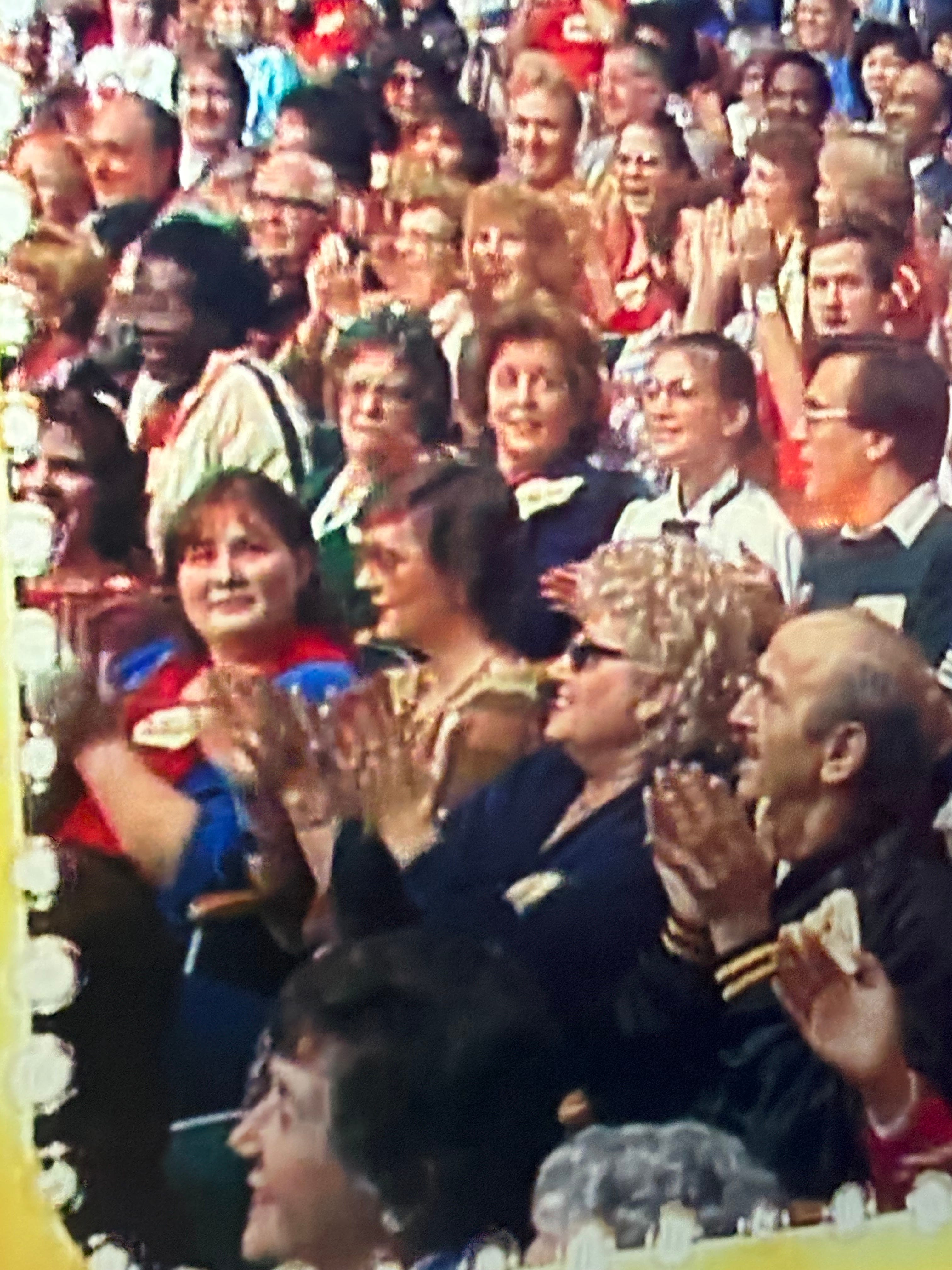
My default show to watch with Hank lately has been The 24-Hour Price is Right channel (The Barker Years, of course). I’ve been taking photos of the screen with plans to eventually make a Price is Right zine. It’s such a perfect time capsule of 1980s style, typography, colors, and products. Hank and I have been having a great time guessing prices and witnessing the pure joy of victory and the agony of defeat.


I also purchased a treasure trove of found photos from Draplin’s yard sale a few weeks ago. It wasn’t until I was assembling new scrap packs that I realized that there were so many dang gems in this five-dollar box of photos.


That’s all for now. Thanks for reading, and again, I would love your favorite 👀 Looking Closely 👀 links to share!
more drawings and words soon,
KBB
One essay about looking closely that I often return to is the one from about ten years ago in Harvard magazine in which the art history professor talks about the assignment she gives to freshman where they have to spend three hours with a work of art and document it. I write about it and link to it here: https://twochords.substack.com/p/listening-and-responding-i
Love all this price is right screenshots!!